Best BI Software in Singapore (2026)
Comparison of business intelligence and analytics platforms for Singapore enterprises and SMEs.
Table of Contents
- 1The Bottom Line
- 2What this article covers
- 3The core problem BI solves
- 4Data connection
- 5Visualisation
- 6Self-service analysis and the maintenance threshold
- 7Data sources and data quality
- 8Data governance and access control
- 9Fit guidance by company situation
- 10Cost structure and implementation
- 11Verifying claims in a vendor demonstration
- 12Data governance and metric consistency
- 13Vendor support and scalability
- 14The role of an internal owner
- 15Explore the products
- 16Common selection mistakes and selection priorities
BI (Business Intelligence) software brings together data scattered across different systems into visual dashboards and reports, helping a company support decisions with data. This article approaches the topic from a comparison standpoint, setting out the functions, data integration, and implementation differences Singapore companies should weigh when comparing BI software, and closing with situation-based fit guidance and selection priorities.
The Bottom Line
BI software turns raw data scattered across spreadsheets, CRMs, and databases into dashboards your team actually acts on. For Singapore buyers, the deciding factor is rarely the chart library, which is similar everywhere, but which ecosystem you already live in and how much modelling discipline your data team can enforce. Match the tool to your stack and your governance maturity, not to the demo.
Who should pick what:
- Already on Microsoft 365 and cost-conscious -> Microsoft Power BI
- Analyst-led visual exploration -> Tableau
- Free exploration of complex data relationships -> Qlik Sense
- Centralised, governed metrics for a data team / embedded analytics -> Looker
- Enterprise scale with strict governance and compliance -> MicroStrategy
What this article covers
- The core problem BI solves
- Data connection and visualisation
- Self-service analysis and the maintenance threshold
- Data sources and data quality
- Data governance and access control
- Fit guidance by company situation
- Common selection mistakes and selection priorities
The core problem BI solves
The value of BI is to bring together data scattered across systems such as ERP, CRM, and spreadsheets for analysis. In a company without BI, the common problem is that every report is produced by manually exporting data from each system and reworking it, which is slow and error-prone, and the figures a manager wants often take several days to appear.
Before comparing BI software, confirm the company's most pressing analysis need. Is it to see sales performance in real time, to analyse the cost structure, or to reduce the burden of manual report preparation. Writing the need specifically is what gives the comparison focus.
Data connection
The first dimension to compare is data connection — whether the BI software can connect to the company's existing data sources. The effectiveness of BI is built on its ability to obtain clean, integrated data.
Confirm whether the BI can connect to the company's ERP, CRM, databases, and spreadsheets, and whether the connection is built-in or needs extra configuration. A BI tool that cannot reach the company's data sources, or reaches them only with heavy custom work, will struggle to deliver regardless of its other strengths.
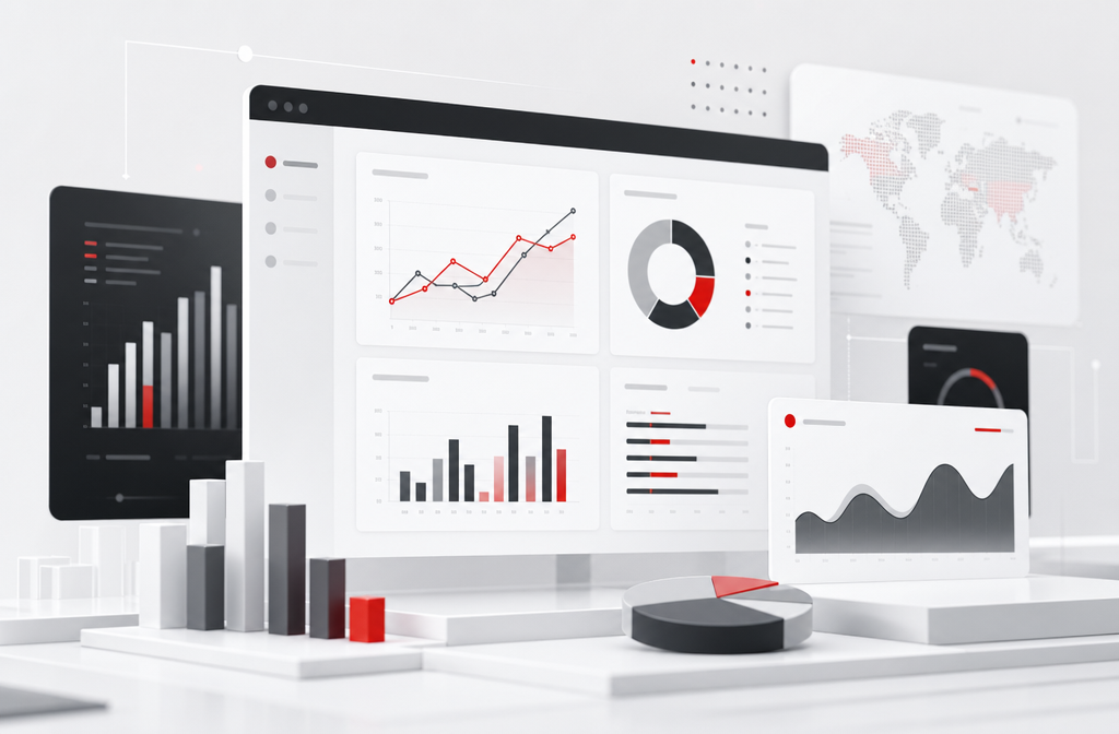
Visualisation
The second dimension is visualisation — whether the dashboards and charts are clear and allow interactive exploration. Visualisation that is clear and easy to read is what makes managers willing to look at the data regularly.
Confirm whether users can filter, drill down, and explore detail within a dashboard, rather than only viewing a fixed picture. Interactive visualisation lets a manager move from an overview to the underlying detail when something looks unusual, which is the difference between a report that is read once and a dashboard that is used.
Self-service analysis and the maintenance threshold
The third dimension is self-service analysis — whether ordinary users can build reports themselves, rather than depending on IT staff every time. The fourth is the maintenance threshold — how difficult it is to build and maintain the data model.
The more powerful a BI tool, the more it usually requires dedicated staff to maintain the data model. If the company does not have such staff, choosing an easy-to-use, self-service-friendly tool is what genuinely lets BI be used across departments. Compare against the actual users: if analysts operate the tool, depth matters; if departments are to view data themselves, ease of use matters more.
Data sources and data quality
The effectiveness of BI rests on clean, integrated data. If the data definitions across systems are inconsistent, or the master data is disorganised, the reports BI produces are equally untrustworthy. BI does not automatically correct data problems.
Before selection, assess the data organisation effort, which is often more demanding than choosing the tool itself. Turning data scattered across systems, with inconsistent definitions, into an analysable state is real work, and building it into the implementation plan is what lets BI deliver value.
Data governance and access control
Because BI brings together data from across the company, data governance and access control are worth confirming during selection. Without proper permission control, sensitive financial or HR data could be accessed by people who should not see it.
The BI software should let you set, by role, who can see which data and which dashboards. Data governance also includes the consistency of metric definitions — if different reports define revenue or active customers differently, BI can create confusion rather than clarity, so whether the BI can centrally manage metric definitions is worth evaluating.
Fit guidance by company situation
There is no single best BI, only the choice best suited to your company situation. The table below is a reasonable starting point.
| Company situation | Suggested direction | Reason |
|---|---|---|
| Simple needs, fixed reports | ERP built-in reports or lightweight BI | Basic reports are enough, low implementation cost |
| Departments to view data themselves | Self-service BI valuing ease of use | Lets non-technical users build reports |
| Has a dedicated data team | Analytical BI with functional depth | Supports complex data models and analysis |
| Many scattered data sources | BI valuing data connection capability | Can integrate data from multiple systems |
The company situation is only a reference; what should be assessed honestly before adopting BI is the company's data condition and analysis culture. Where data is disorganised and the organisation is not used to looking at data, even a powerful BI struggles to deliver.
Cost structure and implementation
BI cost includes the software, implementation, data model building, training, and ongoing maintenance. Estimate the total over three years, and confirm how licensing cost changes as the number of users grows, since BI use often spreads from one department to the whole company.
Confirm too which capabilities are included and which need an additional purchase. The data organisation effort is the most underestimated part of a BI project, so build a realistic allowance for it into the plan rather than assuming the tool will handle it.
Verifying claims in a vendor demonstration
A BI demonstration is usually run with tidy sample data that makes every tool look capable, so prepare a checklist before it begins and have the same items shown by each shortlisted vendor on equal terms. The aim is to see how the tool behaves against your real data.
Worth verifying: connecting to your actual data sources, building a dashboard with your real data, having a non-technical user adjust a chart, and confirming how and how often the data refreshes. These operations expose gaps a feature list cannot, such as connection limits or self-service analysis that is harder in practice than in the presentation.
Have the people who will actually use the BI join the trial. If departments are to view data themselves, let non-technical members try building or adjusting a report and observe whether they can do it. Their experience predicts adoption better than a feature comparison, so collect their feedback before the final decision.
Data governance and metric consistency
Because BI brings together data from across the company, data governance is a comparison dimension in its own right. Without it, the same dashboard can show figures that different departments interpret differently.
A core part of governance is metric consistency. If one report defines revenue or active customers one way and another report defines it differently, BI produces confusion rather than clarity. Confirm whether the BI can centrally manage metric definitions so that the whole company works from one standard. This matters more as BI use widens beyond a single team.
Access control is the other part. The BI should let you set, by role, who can see which data and which dashboards — sales data open to sales managers, cost data open to management. Confirm how granular the permission settings are, and whether row-level control is possible, so that bringing data together does not expose sensitive information.
Vendor support and scalability
BI is a long-term system whose analysis scope may gradually widen, so the comparison should weigh the vendor's support and the system's scalability, not only the initial functions and price.
Ask each vendor about the support channels and response time, whether it can help connect new data sources, and how the licensing cost changes as the number of users grows. BI use often widens from one department to the whole company, so the cost and technical support of expansion are worth confirming early.
Confirm too whether the system can carry the growth in data volume. As the analysis scope widens, both the data volume and the number of dashboards increase, and if the system's performance cannot keep up, the user experience declines. Building scalability into the comparison avoids the system being unable to support the company's needs later.
The role of an internal owner
A BI tool delivers value only if someone in the company owns its use. The comparison and planning should account for who will maintain the data model, build the foundational dashboards, and drive the habit of looking at data.
Where the company has a data team, that ownership is clear; where it does not, an easy-to-use tool with a low maintenance threshold makes informal ownership feasible. Either way, naming an owner — someone responsible for keeping dashboards current and helping colleagues use them — is what stops BI from becoming a set of dashboards no one maintains. The tool is only as effective as the ownership behind it.
Explore the products
Common selection mistakes and selection priorities
Knowing the common mistakes lets you avoid most regret at the comparison stage.
- Overestimating the tool, underestimating that data organisation is the foundation of BI
- Choosing a tool with deep functions but no staff to maintain the data model
- Overlooking ease of use for ordinary users, so BI is used only by IT
- Not confirming the data connection method with existing systems
- No one to drive use after go-live, so the organisation does not build a habit of looking at data
Selection priorities can be summarised as: confirm the most pressing analysis need first, compare the four dimensions of data connection, visualisation, self-service analysis, and the maintenance threshold, and assess the data condition honestly. BI effectiveness depends on clean data and the organisation's habit of use; the tool itself is only one part.
Recommended Services
Looker
Looker is a data platform and business intelligence tool from Google Cloud that uses a proprietary modelling language (LookML) to define data metrics centrally and deliver governed analytics.
Microsoft Power BI
Microsoft Power BI is a self-service business intelligence platform that enables business users to create interactive dashboards and reports by connecting to hundreds of data sources.
MicroStrategy
MicroStrategy is an enterprise business intelligence platform offering large-scale reporting, dashboards, mobile BI, and embedded analytics for global organisations.
Qlik Sense
Qlik Sense is a business intelligence platform built on an associative analytics engine that allows users to explore data relationships freely without predefined query paths.
Tableau
Tableau is a leading data visualisation and business intelligence platform known for its intuitive drag-and-drop interface and powerful visual analytics capabilities.
Feature Comparison
| Products | Pricing | Interactive Dashboards | Self-Service Analytics | Data Connectivity | Mobile Reporting | AI-Powered Insights | Official Website |
|---|---|---|---|---|---|---|---|
| Custom quote | ✓ | ✓ | ✓ | ✓ | ✓ | Official Website | |
| Custom quote | ✓ | ✓ | ✓ | ✓ | ✓ | Official Website | |
| Custom quote | ✓ | ✓ | ✓ | ✓ | ✓ | Official Website | |
| Custom quote | ✓ | ✓ | ✓ | ✓ | ✓ | Official Website | |
| Custom quote | ✓ | ✓ | ✓ | ✓ | ✓ | Official Website |
Frequently Asked Questions
IT Trend Editorial Team
We are a team of technology experts dedicated to helping businesses find the right software solutions. Our editorial team reviews, compares, and evaluates B2B SaaS products across multiple categories to provide unbiased, data-driven recommendations.
About our editorial team →